The project
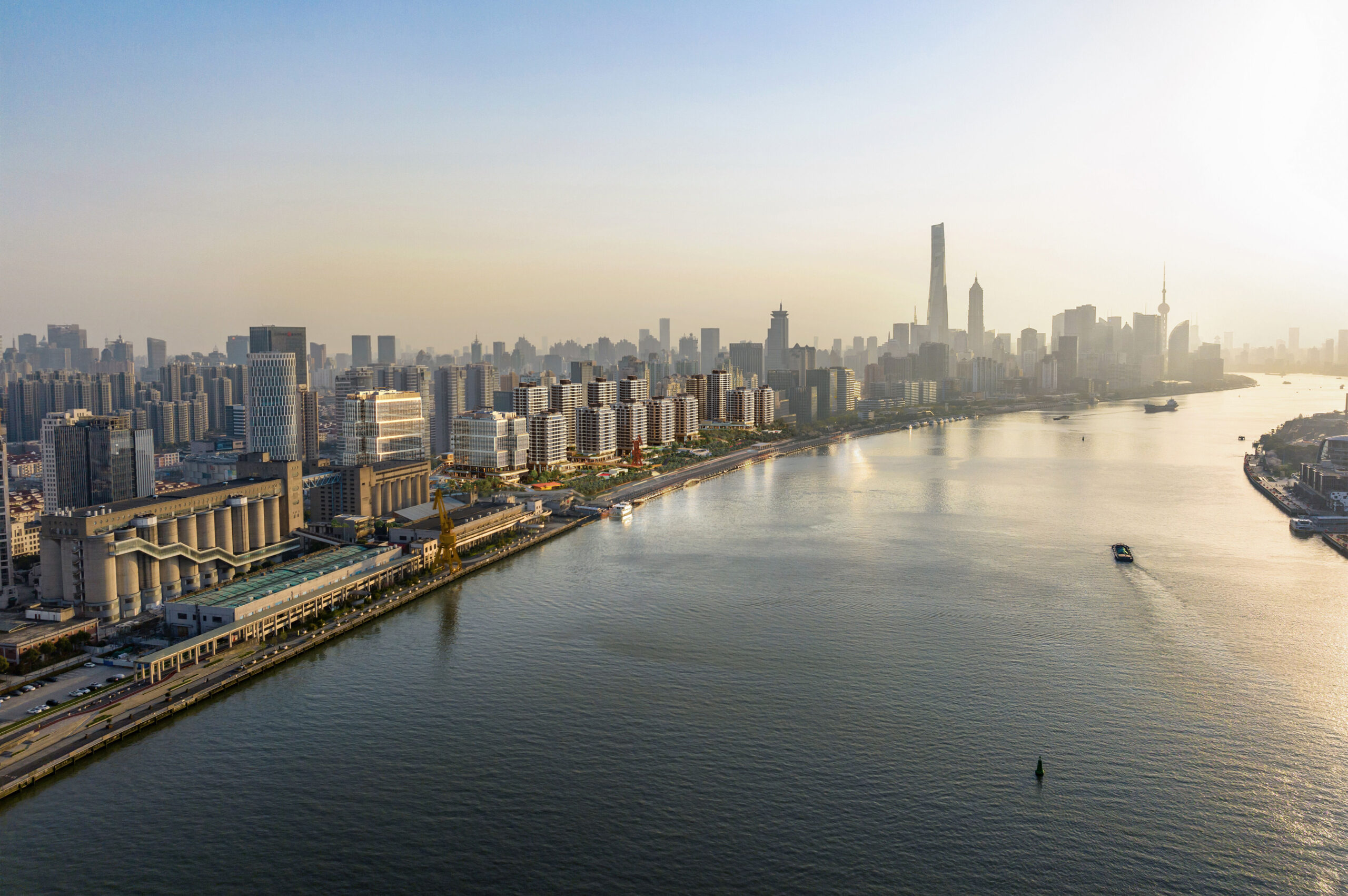
Make entered a competition in 2019 to design the facades for a premium shopping centre in China.
Inspired by the elegance and radiance of silk, a symbol of luxury, our proposal exposes the development’s existing concrete buildings and wraps them in a new cladding that resembles a flowing ribbon of silk. The facade design follows the current lines of the structures while providing a new focal point in the city.


The starting point
First we made a foamboard sketch model of the shopping centre and experimented with draping a piece of fabric over the top. This helped us analyse how the fabric would drape and fall, creating gentle curves and flowing lines across the length of the site.
The final model
We wanted to convey a luxurious feel with the model, so we started with a black gloss acrylic base, then we laser-cut frosted acrylic blocks to create the form of the existing shopping centre. By reducing the main building to simple shapes, we were able to keep the focus on the facades.
We then used the same data as the Design Visualisations team to digitally model the delicate roof structure and facade panels, 3D-printing them on our Formlabs 3D printer. This was the most challenging part of the model, as the shapes are very intricate and organic, and the high-quality printed components were very fragile to work with. We then spray-painted the panels in gold and silver paint before putting them into place, giving the model a shiny, metallic finish that enriches the luxury feel.
We scored lines into the base to indicate the roads and pedestrian routes surrounding the site, and then filled them with gold paint to complement the rest of the model. We laser-cut clear acrylic pieces to create the surrounding contextual buildings, layering them one floor at a time to communicate their scale.
Integrated lighting in the base illuminates the model, highlighting the metallic details and showcasing the rippling texture of the fabric-like cladding.
Together with the visualisations, drawings and video, the model completes a cohesive portfolio of materials that communicates the design.
