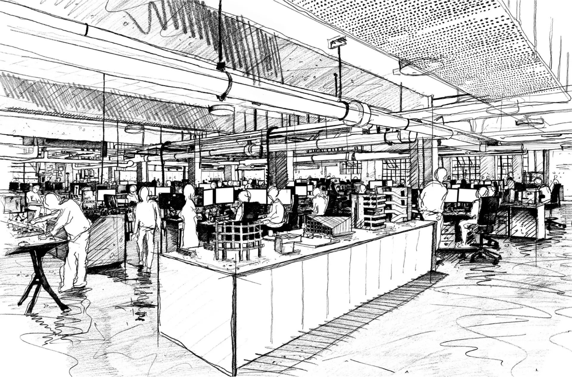
The advent of the personal computer fundamentally changed the energy consumption of commercial buildings. The computers of the 80s and 90s produced more than twice the heat of the people using them. And while lighting technology became more efficient, offices became deeper in plan, putting huge pressure on the facade to bring in as much natural light as possible to keep the dependence on expensive lighting down.
The balance was tipping. Full-height glazing let in more light but also more heat, which then couldn’t escape. People looked to air-conditioning to get the heat out, which requires a significant amount of energy, and building roofs became covered in chiller units, which effectively pump heat into the atmosphere. It’s like lighting a fire to cool down – it doesn’t make sense.

The next generation
Thanks to LED lights, which are ten times more efficient than the lighting of the 60s, and modern laptops, which only use a fifth of the energy of early computers, we consume less energy inside our buildings these days. The sun is getting stronger, though, and proportionally the biggest issue we now face is solar gain.
Facade insulation and glass technology are effective measures for reducing solar gain, but these alone can only ever be part of the solution. The growing quality and affordability of LED lighting means we’re less dependent on external light sources, so windows today function as facilitators for wellbeing more than anything, cluing us into the weather and time of day, letting in natural light and shadows, and framing beautiful views for us to enjoy. We should take this moment as an opportunity to reassess the role glass has in office design – to rethink our relationship with windows and figure out how to design in their benefits and design out their downsides.
Make’s approach
At Make we’ve developed an ethos of prioritising the users of our buildings and their needs above all else. Applying this to office design while also honouring our commitment to sustainability has meant exploring alternatives to glazed facades. After all, loving natural light doesn’t mean shunning shade. Consider traditional Japanese houses or Roman temples like the Pantheon – their complex interplay of shadow is just as emotionally fulfilling as sunshine pouring in through a large glass atrium.
We’ve come to the conclusion that designing more solid office buildings where windows are carefully placed only where they’re needed is our best bet for reducing heat waste while meeting users’ wellbeing needs. Simply raising windows off the floor by the height of a desk can reduce the air-conditioning load by 20% at peak summer times – think what else is possible if we couple strategies like this with higher ceilings and solar gain-reducing technology.
You can see this in action at our 5 Broadgate, our new headquarters for Swiss financial firm UBS in the City of London. The building – home to 10,000 staff – was designed with major carbon savings in mind. By starting with a solid block and carving light into it via carefully positioned atria, light shelves and lifts, we’ve created a facade that significantly minimises the energy needed for cooling and heating, all the while retaining a human scale and capturing amazing views and high levels of natural light. The building is rated BREEAM ‘Excellent’ – attaining one of the highest BREEAM scores ever awarded to a London office development – and functions at 50% higher efficiency than Building Regulations require.

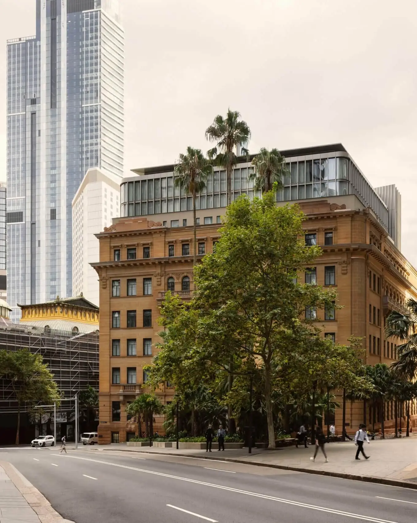
Our recently completed office scheme at London Wall Place also used solidity at its starting point, eventually achieving an overall glass-to-solid ratio of 50%. This largely comes down to an orientation that optimises views and a vertical expression that layers stone and ceramic – materials that are important to the context of the site and its history.

At St James’s Market, meanwhile, we opted for a horizontal expression in natural stone – again, a material that complements the local area. In this design, an over-sailing form provides natural shading to the south, and a carefully placed central skylight creates a dramatic atrium. As with the other examples, the glazing has been set at a height that maximises views, reduces solar gain and formally responds to its local streetscape.

Embracing a language of solidity
Reining in solar gain doesn’t have to mean resigning ourselves to dark, window-less offices. It’s all about revisiting our relationship with natural light and rewriting our design vocabulary into one that puts sustainability on par with wellbeing.
A key part of this is understanding that changing the way buildings work on such a fundamental level will change the way they look from the outside, with larger, more solid buildings the likely result. Judging architecture on the basis of crude aesthetics will always promote the familiar over the novel, but we need to fight that familiarity through education and encourage people to embrace these changes.
If we get it right, our children will thank us. If we aren’t careful, the future may not be the one we’re hoping for.
