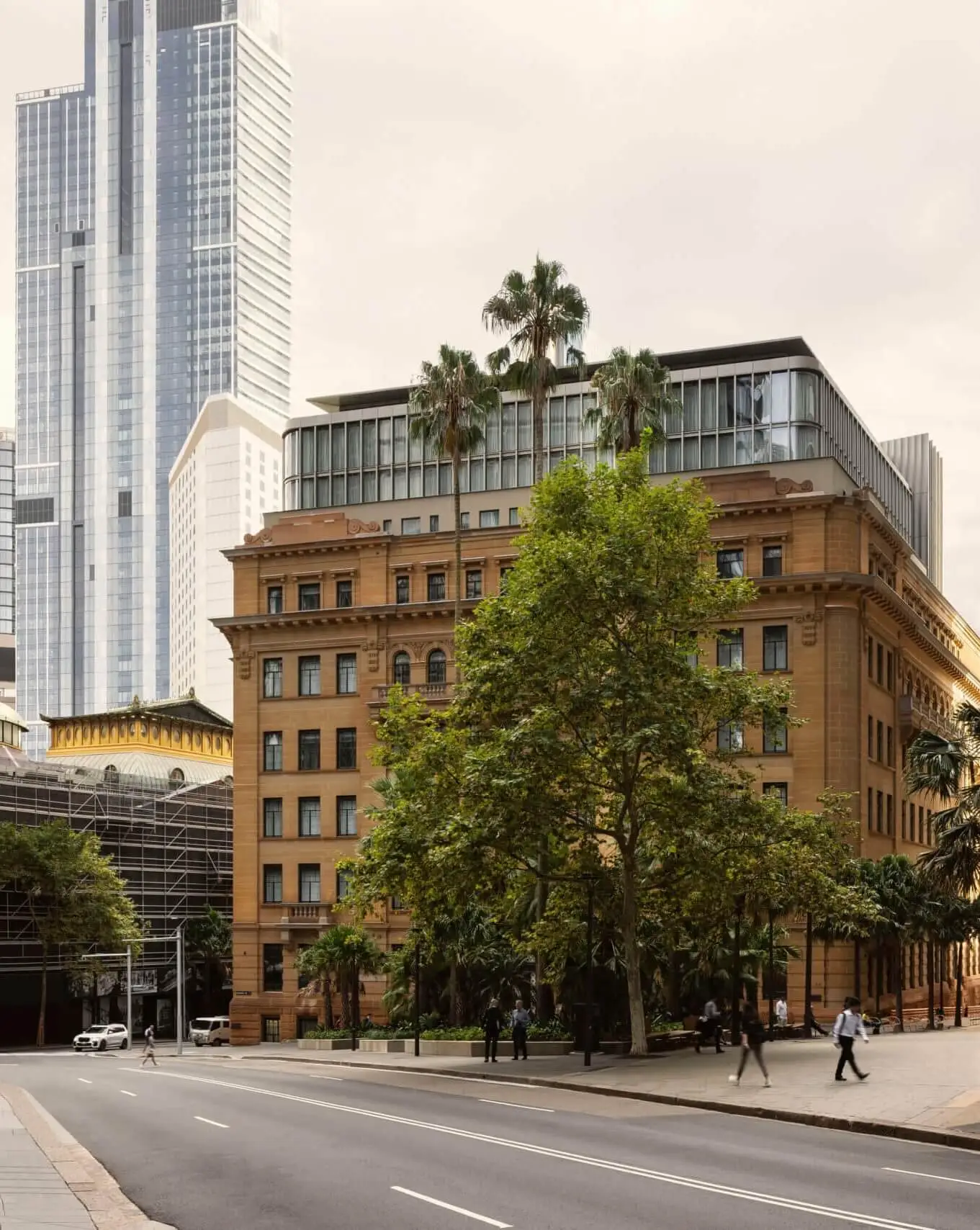
Capella Sydney transforms an iconic listed building in the heart of Sydney into a world-class 5-star hotel. The first Australian property for the Capella Hotel Group, the former government building now welcomes the public in for the first time.
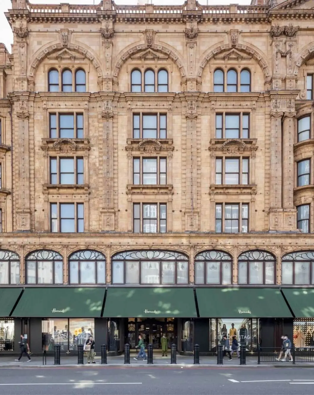
Originally designed by renowned Scottish-Australian architect George McRae (Sydney Town Hall, the Queen Victoria Building) for the New South Wales government, the listed building on this site dates back to 1912 and was constructed in 2 halves approximately 15 years apart: the northern half for the Department of Education, the southern half for the Department of Agriculture. Located 400m from Sydney Harbour and taking up an entire block in the CBD, the building features an Edwardian Baroque-style sandstone facade and stands as a reminder of Sydney’s grand architectural heritage, which endures alongside surrounding skyscrapers.
Our brief was to retain as much of the original heritage fabric as possible while transforming the building into a world-class luxury hotel, setting a new benchmark for hospitality in Australia with the Capella Hotel Group’s first Australian offer. In collaboration with Aspect Studios, we’ve also transformed the adjacent Farrer Place outside the front entrance with new paving, greenery and seating that re-establishes it as a pivotal city square and engages the site with the wider city. BAR Studio delivered the interior design, which embraces the existing built fabric while creating a counterpoint to the once-utilitarian interiors.
Taking the 8-storey structure to 11 storeys, we’ve replaced existing rooftop additions with an extension that features bespoke fluted fins and curved glass corners, which we’ve set back to celebrate the sandstone facade. Inside we’ve reconfigured and consolidated the 2 halves of the building to improve circulation and designed 192 grandly proportioned guest rooms, starting at 40m² and culminating in the 235m² Capella Suite. We located the pool and wellness and spa facilities on level 6, beneath heritage roof lanterns that draw in natural light, and we opened up the ground floor with publicly accessible new event and meeting spaces, plus three food and beverage venues.


We worked with heritage consultant Urbis to understand the history of the site and building, ensuring all areas of exceptional heritage significance were restored or retained, such as the sandstone facades, and any intrusive or detrimental interventions were removed. This work was fundamental to achieving a complementary refurbishment and extension that respects the integrity of McRae’s original design. Preserving and celebrating the heritage was important to us, but doing so in a manner that avoided pastiche design details or tried to replicate the existing fabric was fundamental to our approach.
Because the building was built in two halves, the facades were constructed differently: the northern facade is load-bearing, and the southern facade is purely decorative, with a load-bearing steel frame behind. While the shift between the north and south is undetectable from the outside, the distinction is defined by the art inside the hotel, which references the portfolios of the government departments that formerly occupied each half of the building.

As part of the refurbishment, we reinstated the original floor plans, introducing a circular access corridor on each floor with views to the reinstated rectilinear central courtyard below. This configuration allows guests to orient themselves by looking up to the sky or down to the courtyard from every level. A key design move for us was removing the solid walls (which weren’t part of the original design) between the access corridor and heritage staircase, replacing them with custom timber doors and glazed sidelights. Combined with the placement of the new guest lifts, this creates both a visual and physical connection between the heritage staircase and the lift lobby – a nod to the building’s original detailing that is visible as soon as guests step out of the lift.
We maintained the heritage perimeter slab around the entirety of the building, and located all bathrooms, main risers and services through to the roof on the new infilled slab. This prevented having to penetrate the heritage slabs and informed space planning, allowing us to play around with elevating the entrance sequence to enhance the ground plane.


While we celebrated the existing building and original details as much as possible, we also introduced contemporary interventions to both elevate the guest experience and ensure longevity for the building.
Restoring and upgrading the heritage marble staircases was a particular challenge. The existing wrought iron balustrades were too low in height, and most of the marble stair treads were warped from years of use, making both noncompliant with today’s building code. We worked closely with the contractor team and expert stonemasons to design new marble inserts for the stair, with beautiful contrasting nosings, brass trims and a glass balustrade. We ensured the geometry and rhythm of these additions harmonised with the existing structures, and we brought the detail of the historic metal scrollwork to the forefront in a respectful, seamless way that achieves functionality while maintaining historical integrity.
The hotel won top honours at the 2023 AHEAD Asia Awards in three categories, including Best Conversion, Lobby and the coveted Hotel of the Year. The judging panel commended the design for its “expert transitions between new and existing architecture,” which work together to create “a reimagined sequence of spaces that delight.”


The 4-storey modern extension responds to and expands on the listed structure beneath. We treated it as secondary to the original building both in terms of massing and design, setting it back and wrapping it in bespoke fluted anodised metal fins and curved glass corner details that complement the heritage architecture. These new floors house larger guestroom suites – notably different to those in the heritage portion owing to the change in ceiling height and windows – but still maintain the design identity of the hotel as a whole.
The roof design was integral to the overall scheme, especially as it can be seen from neighbouring tall buildings. We included bespoke cladding and fish-scale perforated screens that nod to the heritage metalwork details at Farrer Place and conceal the roof plant and services, allowing the building to be read from above, just as it is from the street.
From a sustainability perspective, it was important to not only retain as much as possible but also limit the amount of excavation and embodied carbon associated with the project. One of our key moves from the beginning was the consolidation of back-of-house (BOH) areas for Capella Sydney and the Lands Building next door, meaning we only needed to excavate one building to provide services for both – reducing risk to the listed buildings as well as associated costs and carbon.

Capella Sydney’s main entrance is located on Farrer Place, a public triangle-shaped space that links to neighbouring office buildings and routes to the harbour. We’ve worked hard to establish a relationship with the public realm outside the hotel to create a welcoming arrival sequence for guests that can also be enjoyed by people passing by. With help from consultants and landscape architect Aspect Studios, we’ve integrated the history of the site into the landscaping using plaques and art. We’ve also retained mature palms and introduced new planting to enhance the hotel and public realm alike.
A welcoming sequence of ground floor spaces greets visitors as they step through the entrance. We were inspired by McRae’s original concept drawings, which showed a rectangular garden at the heart of the plan, and by Florentine palazzos, which feature delicate arcaded courtyards and internal gardens at their centre for building occupants and visitors to enjoy. We’ve curated a journey through the new reception lobby into the public bar and restaurant venues, with the ceiling heights expanding from one space to the next. This gesture guides guests from the heritage marble vestibule entrance into the contemporary double-height spaces, and finally through to the central courtyard, with its glass ceiling revealing the sky above. The interface between the old and new is communicated through artworks that reflect the area’s rich heritage across the hotel’s public spaces.


Stitching new columns and slabs with the existing structure across all levels allowed us to gain double-height spaces on the ground floor and reinstate the courtyard according to McRae’s original design. Mainly on the south side of the building – to protect the original footings on the northern side of the building – these structural interventions determined how we set out the services and upper-floor massing, as well as the BOH areas. The new, enlarged spaces now house three public bars and restaurants, with all BOH areas consolidated in three basement levels beneath.
Each of the three food and beverage venues has its own character and unique design details. The courtyard venue, Aperture, features a bespoke kinetic sculpture by Amsterdam-based Studio Drift, weeping fig trees and a 7m green wall beneath a double-height glass ceiling; the McRae Bar features hand-painted murals by Gumbaynggirr/Bundjalung artist Otis Carey; and the hotel restaurant, Brasserie 1930, combines rich timber finishes with a black and white marble floor.


As part of the planning permission, we needed to preserve the level 6 gallery as one large, open space. Rather than double up on event space, we decided to repurpose the gallery and transform it into a luxury wellness centre. We took inspiration from the heritage copper-lined roof lanterns to inform the spatial planning. The treatment rooms are formed from a series of sculptural interlocking bronze-toned cubes that we inserted into the space, locating each room under a roof lantern. We also restored the lanterns to bring in plenty of natural light and celebrate the interplay between heritage details and modern luxury.
It was crucial for us to include a pool in the wellness centre, but suspending a 20m swimming pool halfway up the building with guest rooms below required some innovative engineering. Built and TTW, the contractor and structural engineers on the project, were fundamental in this process. To reduce the structural and visual impact on the heritage building, the team developed a self-supporting pool with an independent structure that doesn’t rely on strengthening existing columns.
Artworks like Donald Judd’s metal boxes and Antony Gormley’s installation Model informed the concept for the wellness centre, while Richard Wilson’s installation 20:50 inspired the pool. The pool runs the length of the space beneath the long heritage roof lantern, and its reflections help give the impression of a gallery, hinting at the space’s former use. The design and aesthetic of the level 6 gallery have remained consistent throughout the seven years of the project and have now been realised as we originally envisioned.


