The Cube
The Cube is not a low carbon building by today’s standards, but it challenged business as usual back in 2005 and is still challenging it today. Love it or hate it, it’s not conventional, it’s brave. The conventional approach would have been a sleek tower, but The Cube brings a new aesthetic: it’s boxy, chunky and strange. Today, in the face of the climate emergency, we must be brave enough to challenge conventions and expectations around architectural beauty.
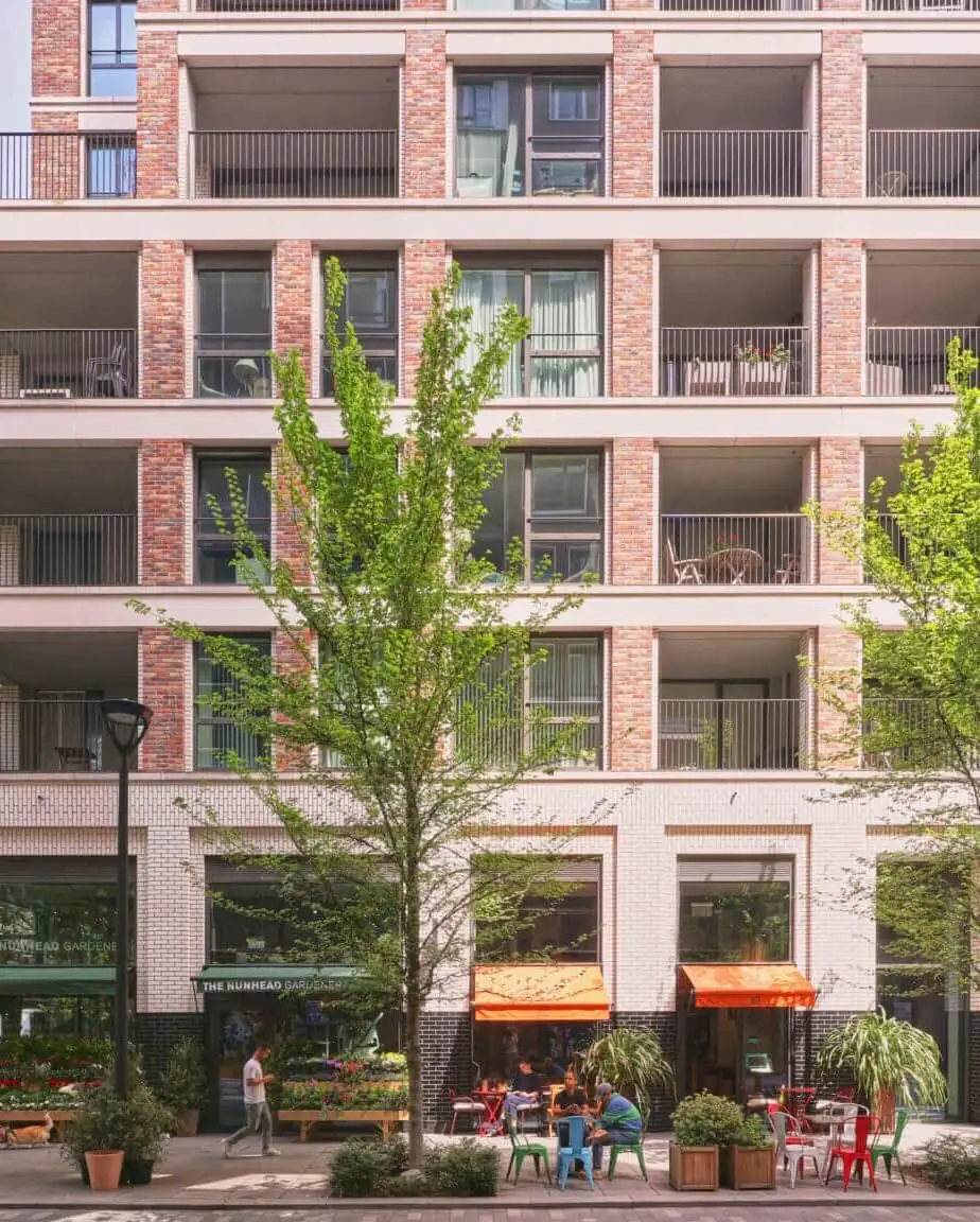
The Cube’s facade is all about energy efficiency: plenty of solidity to limit solar gains and maximise insulation. It’s also about finding a one-size-fits-all cladding grid to meet the needs of retail, office, apartments and a hotel, while allowing flexibility between those uses. The pixelated facade blurs the boundaries of each use, giving one unified identity to the building and its community.
The Cube has become part of Birmingham’s identity. It’s made it onto a tea towel and a tote bag, been featured in an oil painting at the Royal Academy, and even been reconstructed from Lego for Birmingham’s Legoland. But that iconic facade contains a vast amount of aluminium.
With my operational energy goggles on, The Cube looks good: the glazing ratio is tailored to the orientation, there’s good insulation and airtightness. With my circularity goggles on, it looks ok: long lifespan, easy to repair, adaptable, infinitely recyclable, maybe even reusable as a kit of parts. But with my embodied carbon goggles on, the aluminium is problematic. You could argue that aluminium is a good lightweight facade material which minimises the embodied carbon of the structure, but there’s no denying it’s a carbon-intensive material.

We could talk about low carbon and recycled aluminium, but there isn’t enough of these alternatives to go around. Global demand means we need more virgin aluminium, and that means mining for bauxite, digging up rainforests and relocating indigenous communities. So despite its circularity and technological developments, we need to minimise our use of aluminium now.
1 Centenary Square

1 Centenary Square uses far less aluminium. The facade is glass-reinforced concrete (GRC) on a steel framing system (SFS), with aluminium only used for the window frames, which, in hindsight, could have been timber. The GRC has fairly low embodied carbon but, changing to my circular economy goggles, it’s not recyclable at the end of life. It’s also difficult to disassemble the SFS and all the facade layers. However, with a window-wall system, it’s easy to upgrade each window and get to the internal insulation, enabling upgrades to elements of the facade in 20–30 years’ time. While this facade lowers upfront carbon, it’s less circular, prioritising reduced upfront carbon over future scenarios.

With my operational energy goggles on, the woven facade pattern introduces plenty of solidity in the facade and some shading: it’s flat on the north and eastern elevations but ripples on the south and west to catch the light and shade. With hindsight, I realise that adding another layer of solidity to the facade at the base of the windows could have reduced solar gains and further reinforced the woven pattern. We designed the building about ten years ago and we did some solar analyses at the time, but now we need to do even better and ensure we have the time and the fees in the very early stages to carry out sophisticated studies to ensure an optimised facade.
3 Arena Central

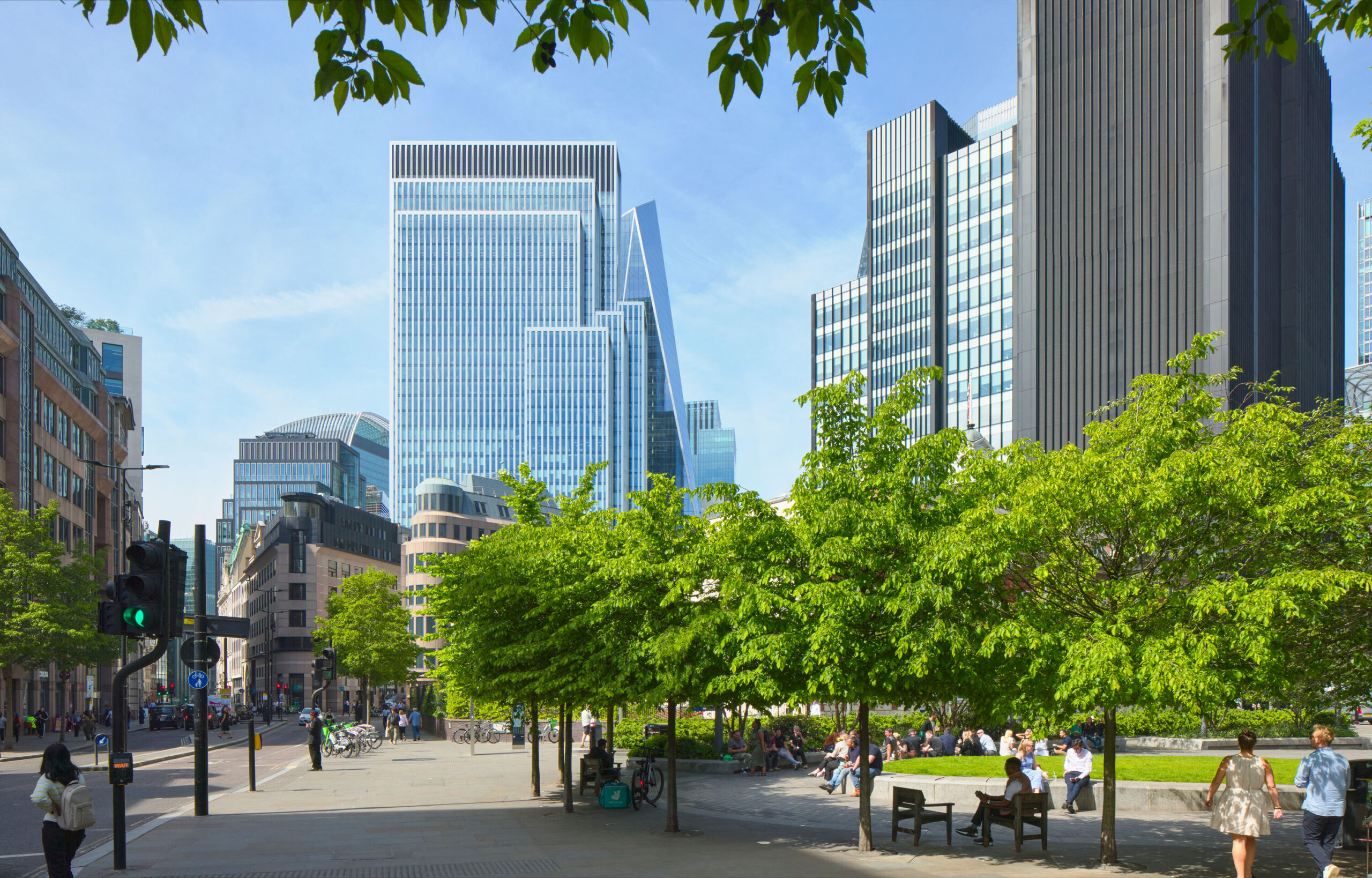
One of the most effective ways to reduce the embodied carbon of a facade is to reduce the amount of facade. The closer a plan is to a circle, the more internal area you get for less facade, so our hexagonal plan for 3 Arena Central provides a more efficient wall:floor ratio than a rectangular plan.
It’s also straight up and down: we need to think about form and massing before we get into materials and details, because features like cantilevers and setbacks increase embodied carbon. This building form also looks great through my operational energy goggles: it reduces both heat loss and solar gains. For a mechanically ventilated building, this is key.


However, through my embodied carbon goggles, aluminium remains a problem. I don’t believe the circularity of the material should outweigh its incredibly high upfront impact.
The University of Birmingham Exchange

Our conversion of the Birmingham Municipal Bank into The University of Birmingham Exchange transformed this Grade II-listed building into an open and welcoming place. We created a rear elevation that opens onto the new public square behind and echoes the design of the front, with its classical solid flanks and central portico.
The simplicity of the new stone flanks, which now house the cores for the building, make them a low carbon choice here. We refrained from adding windows and detailing, which would add upfront embodied carbon, and instead found strength in simplicity.


My circular economy goggles are obviously rose-tinted here, as this is a refurbishment project. But the simplicity of these new stone elevations – ashlar blocks – mean they could be deconstructed and reused again and again. Simplicity is often the best choice for embodied carbon and circularity.
Drum


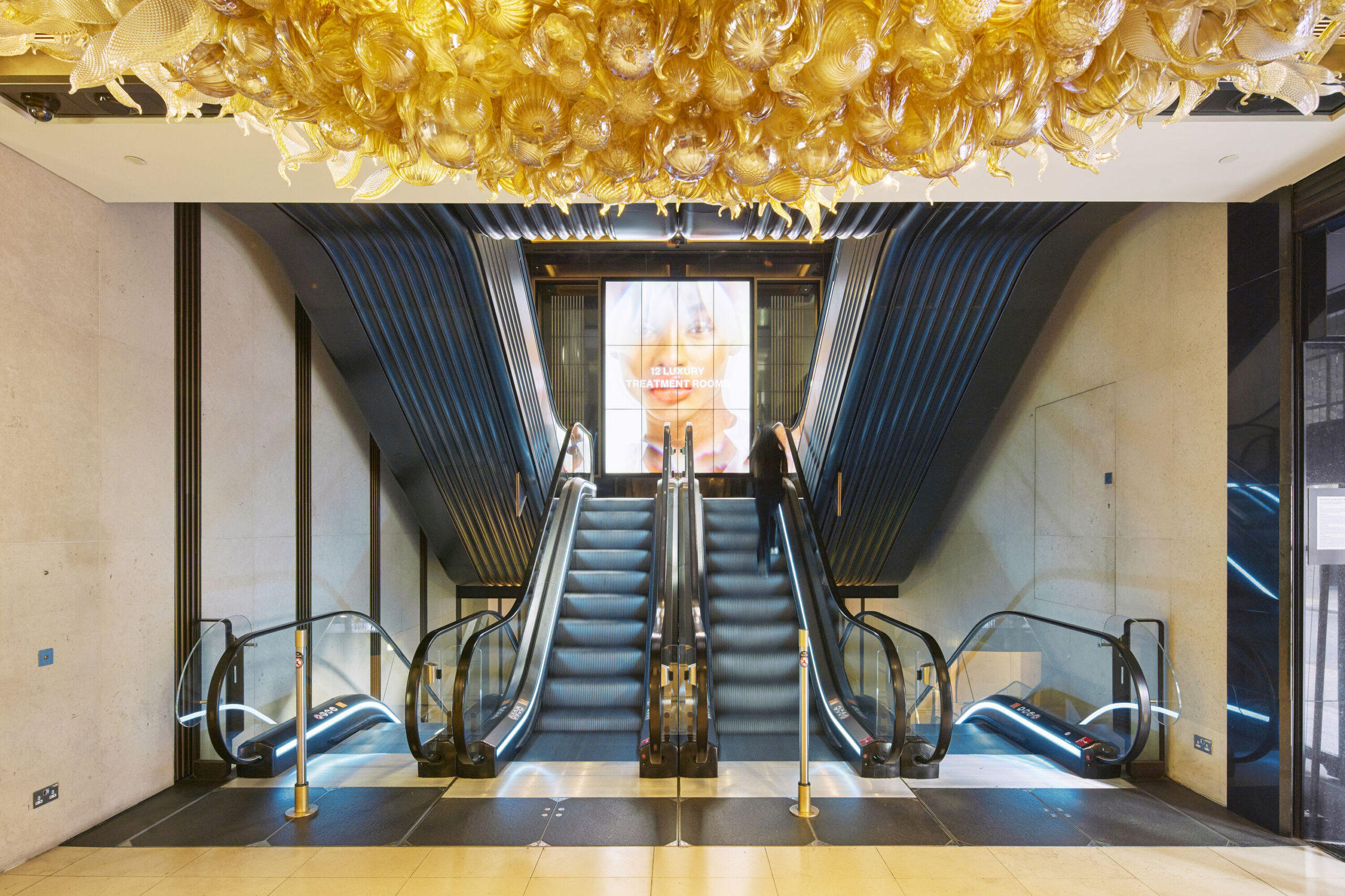
We’re currently reimagining a former department store as a new workplace for Birmingham. From the outside, our conversion involves simply changing the sign, but that belies the complete transformation of the interior.
Rather than replace the fritted glass facade, we turned the building inside out, enlarging the central atrium to make a generous heart that creates the views and activity needed to enliven the office floors. The existing facade only needs to bring in light, therefore it can remain as it is.

We all know that retrofit is the most effective way to cut embodied carbon. Against the LETI bands for upfront carbon, Drum can reach an A+ while delivering Grade A office space. This is the circular economy in action. It’s us embracing our circular economy goggles and designing differently, prioritising the conservation of resources and harnessing the climate emergency to push our creativity.


Finding the goggles you can’t take off
Each project looks good through some goggles but not through all. There are also many other goggles worth exploring, including biodiversity, water usage, toxicity, social value and more. For me, the embodied carbon goggles are the ones that I can’t take off. They’re the ones which colour the way I see buildings now and the ones which focus my conclusions. We need to challenge business as usual and be brave with new aesthetic choices driven by our low carbon knowledge. We need to design out aluminium where possible and prioritise low upfront carbon materials. We need to question complexity, celebrate simple forms and recognise that the most sustainable facade may well be the one that already exists.
