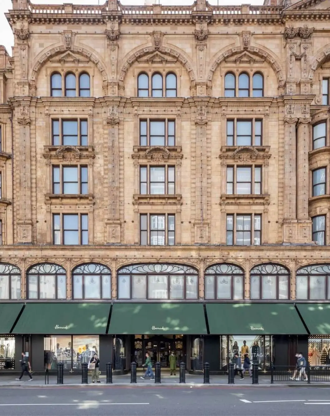
Nonetheless, the architectural detail of the base and the giant order is well considered. The combination of the principal Portland stone rhythm of columns and pilasters, and the striated stone base with wide openings, creates a visually powerful container for the building. The visual weight of the body on its base is relieved by the glass and bronze work that provides a secondary level of visual interest in relation to the primary frame.
Make considered a range of building options for 48 Leicester Square, including early proposals for an entirely new building which would relate to the W Hotel to its north and establish a strong “modern” edge to the west side of the square. However, following initial consultation with Westminster’s planning officers, it was decided that the existing building had external architectural elements worthy of retention.
This led the team to find ways of retaining those parts of the facade – its principal masonry frame as high as the cornice to the giant order – and renewing the glazing and bronze-coloured metalwork that weaves in-between it. The architects found that by adding a cornice above the attic windows, so that they become a classical “frieze” sandwiched between an existing lower and new upper cornice, the proportions of the middle section of the building would be positively transformed.

Several different roof forms were considered that would complement the proportions of the enhanced base and simplify its silhouette. The decision was made early on to select a bronze coloration that would relate to the bronze work of the main body of the buildings and bring it through the stonework frame to a formal resolution at the building’s top.
The proposed roof will become a significant part of the new composition, and while very contemporary in conception and character, it derives from a long and distinguished tradition of Western architectural and urban design: the roof of the Basilica in Vicenza, Italy, was an interesting precedent, with its copper-clad roof providing a strong visual focus, as were exemplars local to Westminster, including the Western Pumping Station at Grosvenor Dock.
Thus, the roof is made up from four curving mansard-like components set parallel to each face of the building and rising from the datum set by the attic storey frieze and new pronounced cornice that surmounts it. The plan of the existing building is not strictly orthogonal and has corners with quite different angles at its southern end. The architects have skilfully overcome the asymmetrical geometry of the plan with a roof that appears simply resolved. It will have large parallel-set corner ridges that rise from the chamfered corners of the existing building and new corner clocks, to a horizontal summit.
The metal framework of “blades” that forms the proposed roof will appear solid from some viewing locations at ground level, where they will appear to overlap one another, and more open from other angles revealing the glazing between them. It will not read as a heavy form, but lattice-like – in some ways similar to the great plant houses of Kew Gardens.
However, and importantly for the specific character of the Leicester Square Conservation Area, the roof of No. 48 has grown out of the retained and enhanced architecture that supports it below, as well as the functional needs of a twenty-first-century commercial building. This will be a compelling architectural synthesis that enhances the architectural and urban reputation of Leicester Square. It will become urbanistically and visually a significant part of the evolving rich urban character of Westminster.

