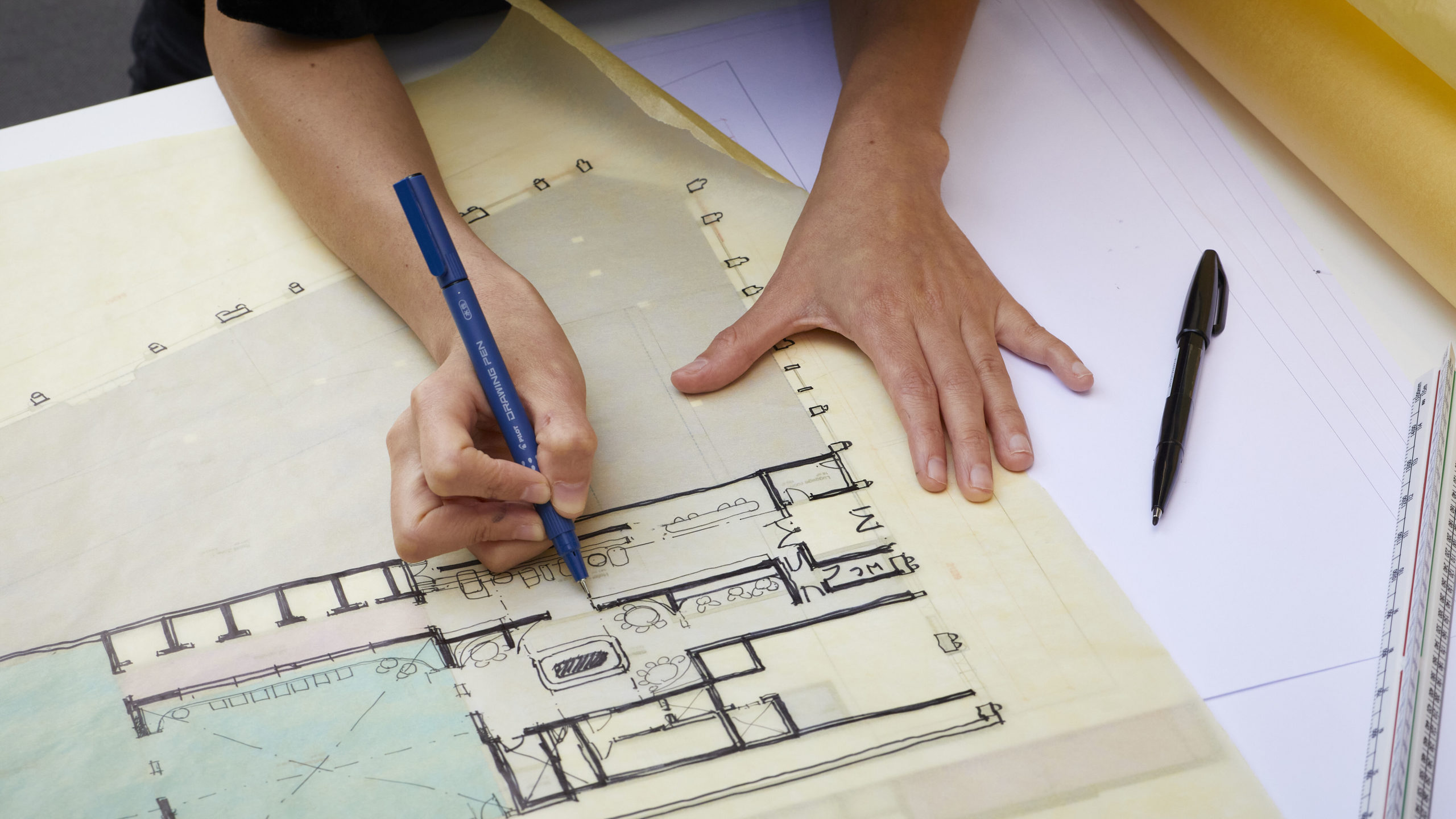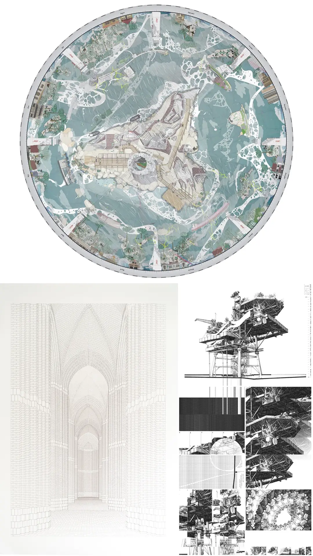
Observing the line widths and distances used for certain scales in the printed version of such plans is one way towards a more artful approach to managing the data-laden drawings. The other is organising individual components in a strategic manner that does away with anything superfluous.
This does not only apply to content, but also unnecessary graphic elements. And so, even plans with technically complex information can become small works of art.
As a counterpoint to this, it is interesting to see how the explanatory detailed drawings of many Japanese architects show remarkable artistic qualities. Among some of them, a special form of representation has developed that deliberately dispenses with the exciting contrast between light and dark surfaces, and instead covers the entire sheet with thin lines, usually of the same width, and over the entire surface. This is a highly poetic way of drawing that matches their designs. The fact that the details of small Japanese buildings in are often less complex is of course a key factor in facilitating this approach to representation.

Nevertheless, the examples mentioned here cannot hide the fact that the passion of many young architects for details is diminishing. This starts with teaching at universities, where design is usually given more attention than construction, and continues in practice when the architect increasingly loses influence in the execution process. Under these circumstances, it is especially welcome news that The Architecture Drawing Prize has extended its entry categories to include that of Working Details.
This post forms part of our series on The Architecture Drawing Prize: an open drawing competition curated by Make, WAF and Sir John Soane’s Museum to highlight the importance of drawing in architecture. Entries for 2019 close 27 September. Sponsored by William Hare Group.


