JASON McCOLL Mark, you were there at the start, and you’re still here at the end, so we’ve got some historic knowledge at this table! I joined the project in 2010 and have stayed with it since. It will be Derwent’s biggest scheme once it’s delivered in 2020. Delivering this has been all about relationships, about learning what the client wants from their site, listening to them, and offering ideas on how to stretch the boundaries while also narrowing that down to the right solution.

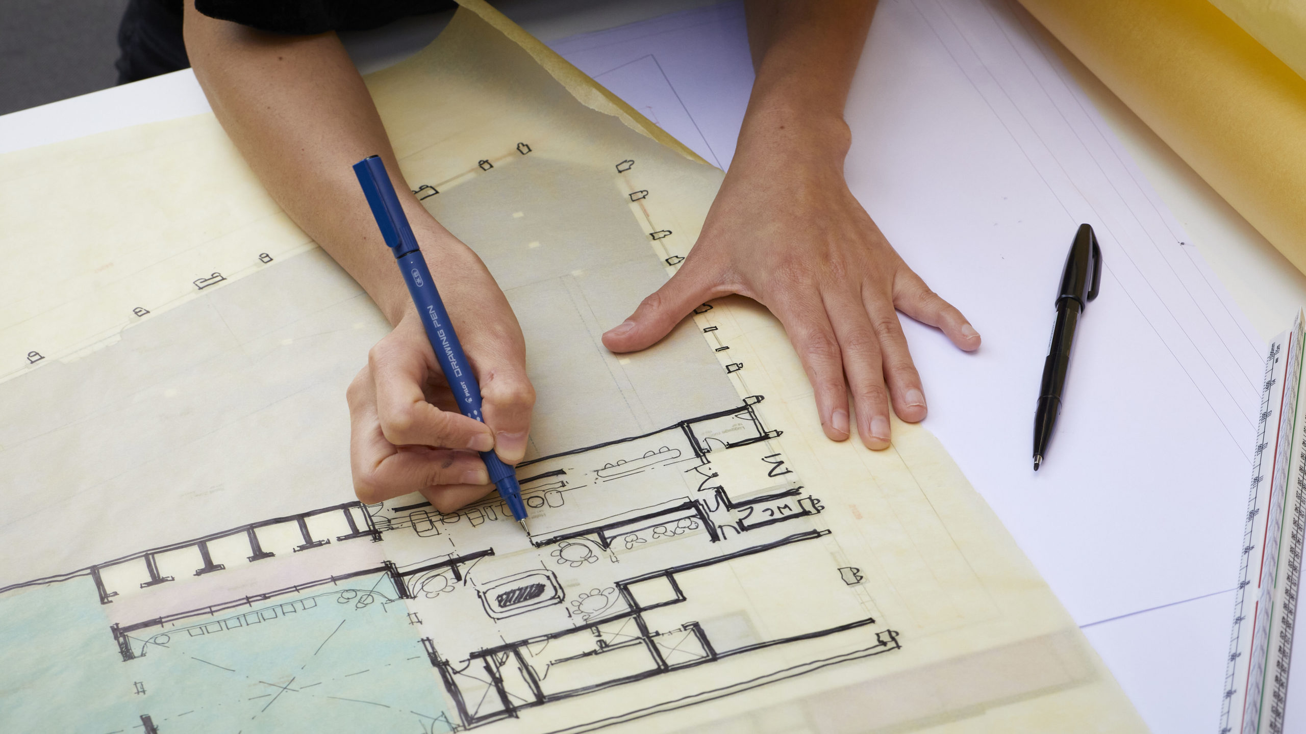
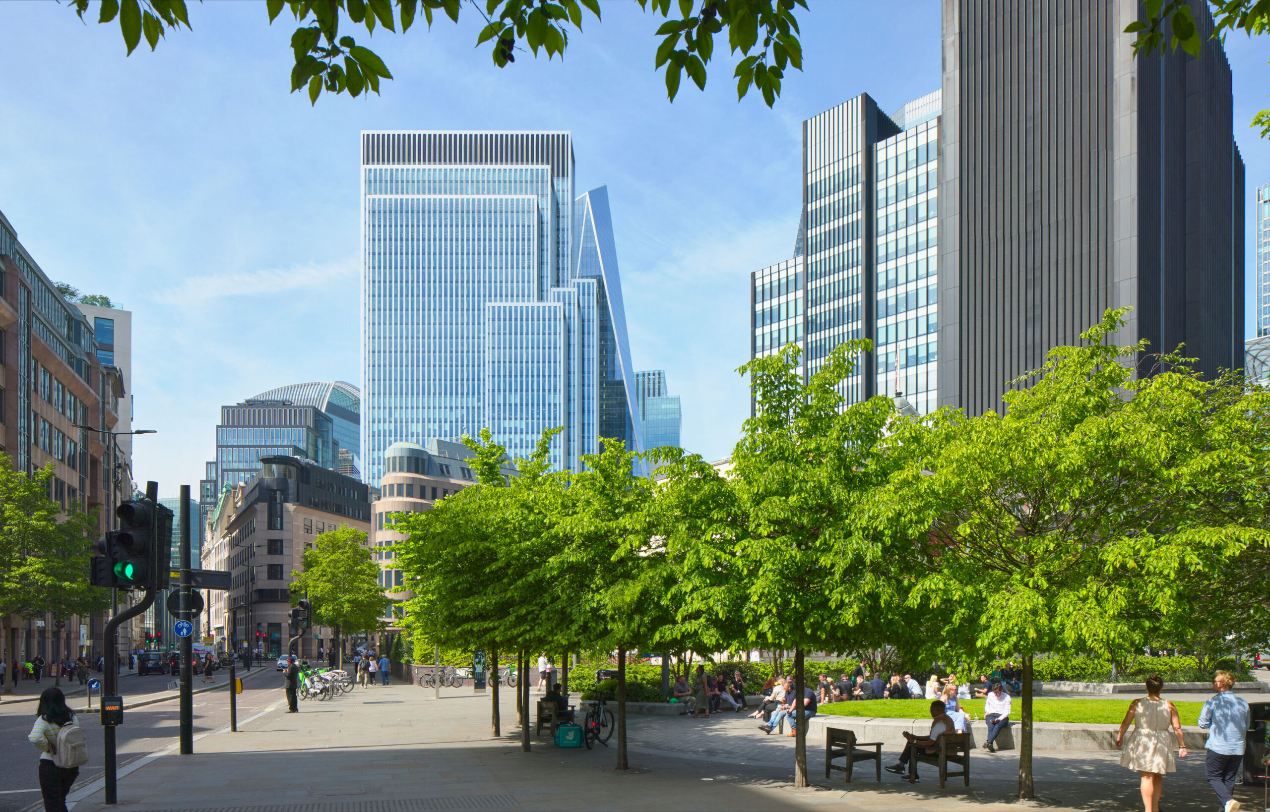
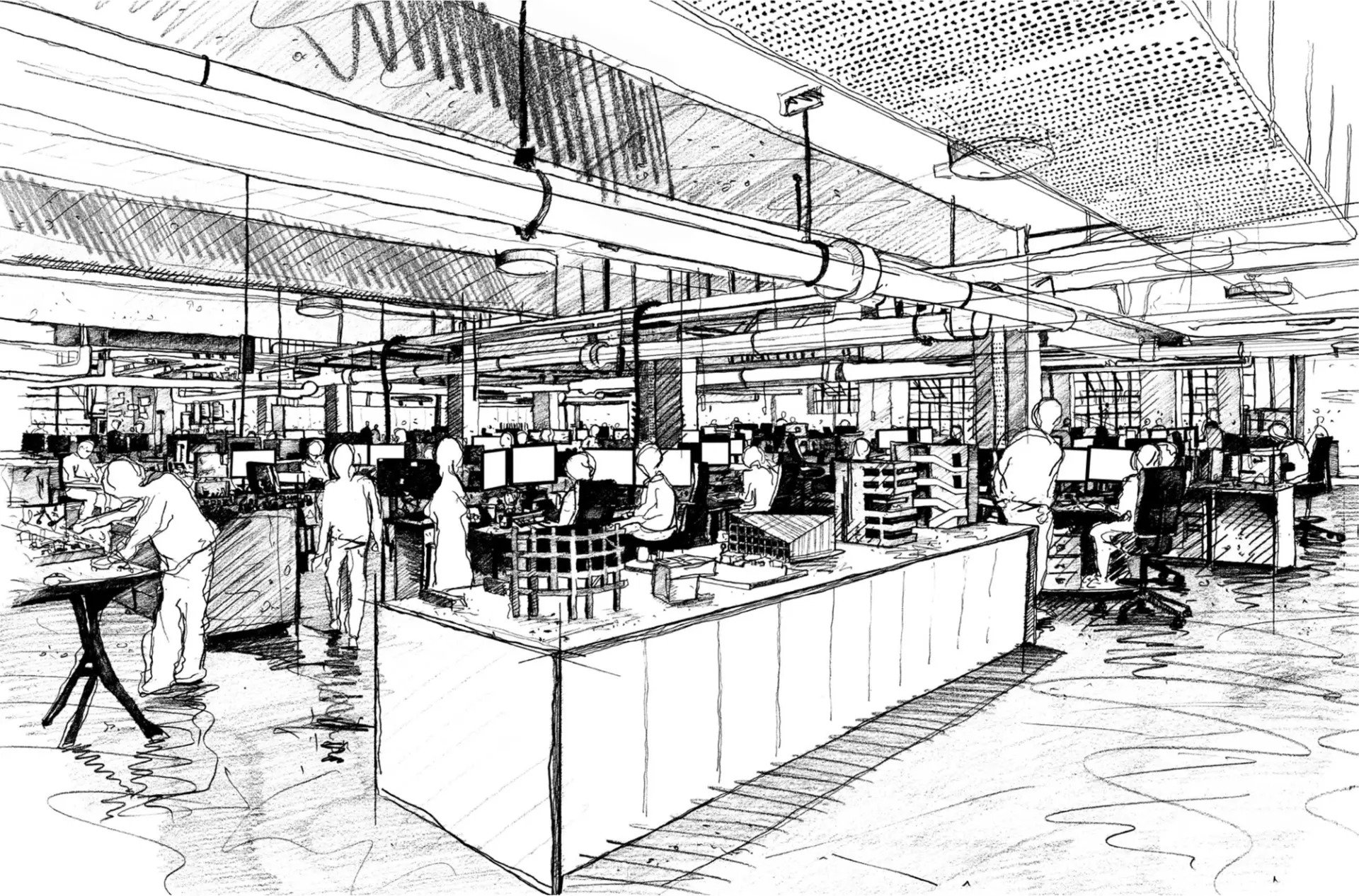
MT Derwent’s really great at having those conversations and letting us test things out on paper and in physical form. The island site is 80m by 80m – a four-sided streetscape that’s partly in a conservation area. When you start designing an office from that, you know you’re going to have a deep plan. You have to consider how to get light in, how to get ventilation. We decided to move the cores of the existing buildings into the middle and leave three of the corners for atria as a way to bring in light. We’ve also added three floors, setting them back to reduce the mass and to provide terraces with views over Fitzrovia.
JM What’s interesting is that the scheme we came up with early on with the central core and three atria – that’s stayed even as the project’s evolved. That was the right solution. We got there quickly, but it’s been about refining it and delivering it.
MT Agreed. The idea was for a flexible floorplate that you could subdivide into multi-tenanted floors, with a consolidated core for lifts, stairs and toilets. Punctuating the corners with atria is about light and ventilation but also a break in the architecture and volume. We use these lines to subdivide the facade.
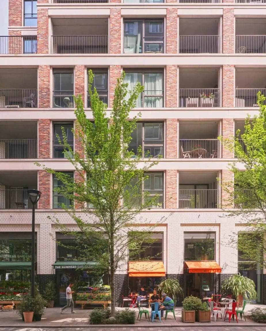
JM That helped hugely with the planning, didn’t it? The planners didn’t want to see a homogenous commercial scheme with one cladding type. It’s a conservation area, so it became all about harnessing the Fitzrovia character and breaking up the massing so that outside it looks like a number of blocks put together.
MT If you look down Charlotte Street, it’s made of many different styles. Originally this site included 3 streets of the same facade, but now it’s broken it up into 12 facade types, 12 building forms.

JM It’s a big building, though. It’s not as if we’re creating complexity for the sake of it. You’ve got the commercial portion, and then there’s a block on one corner of the island site that we’ve retained as residential, with a café below. Asta House across the street is largely residential; we’ve extended it up, and Elliott Wood has taken the office space in the ground and lower ground floors. We’ve even got a pocket park and enhanced public realm. As a mixed-use scheme, it will be a real asset for Fitzrovia.
MT These kinds of projects start and stop at different stages, and of course economies change, client demands change, the office landscape changes. But like you said, there’s been a dedicated team and consistent line of knowledge throughout.
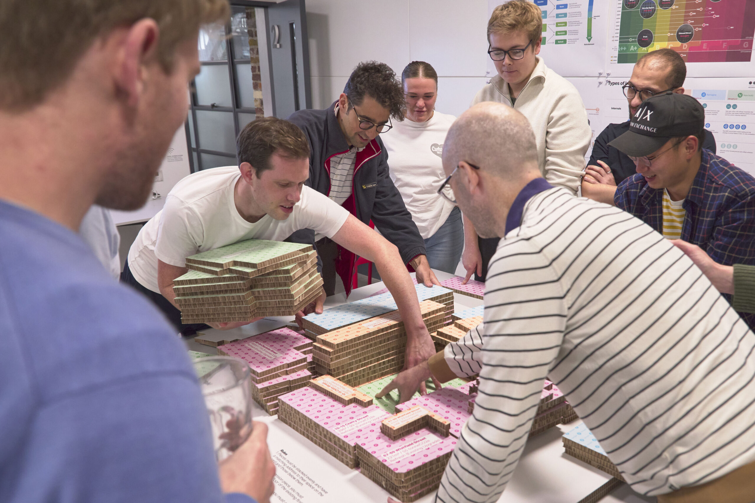
JM Derwent is a fantastic client in their aspirations and their understanding of architecture and the importance of visual elements. Using prototypes is how they like to work and how we like to work. It reduces the risk of getting stuff wrong on site, which can be costly.
MT Yes, it’s refreshing to have a client who’s willing to do that.
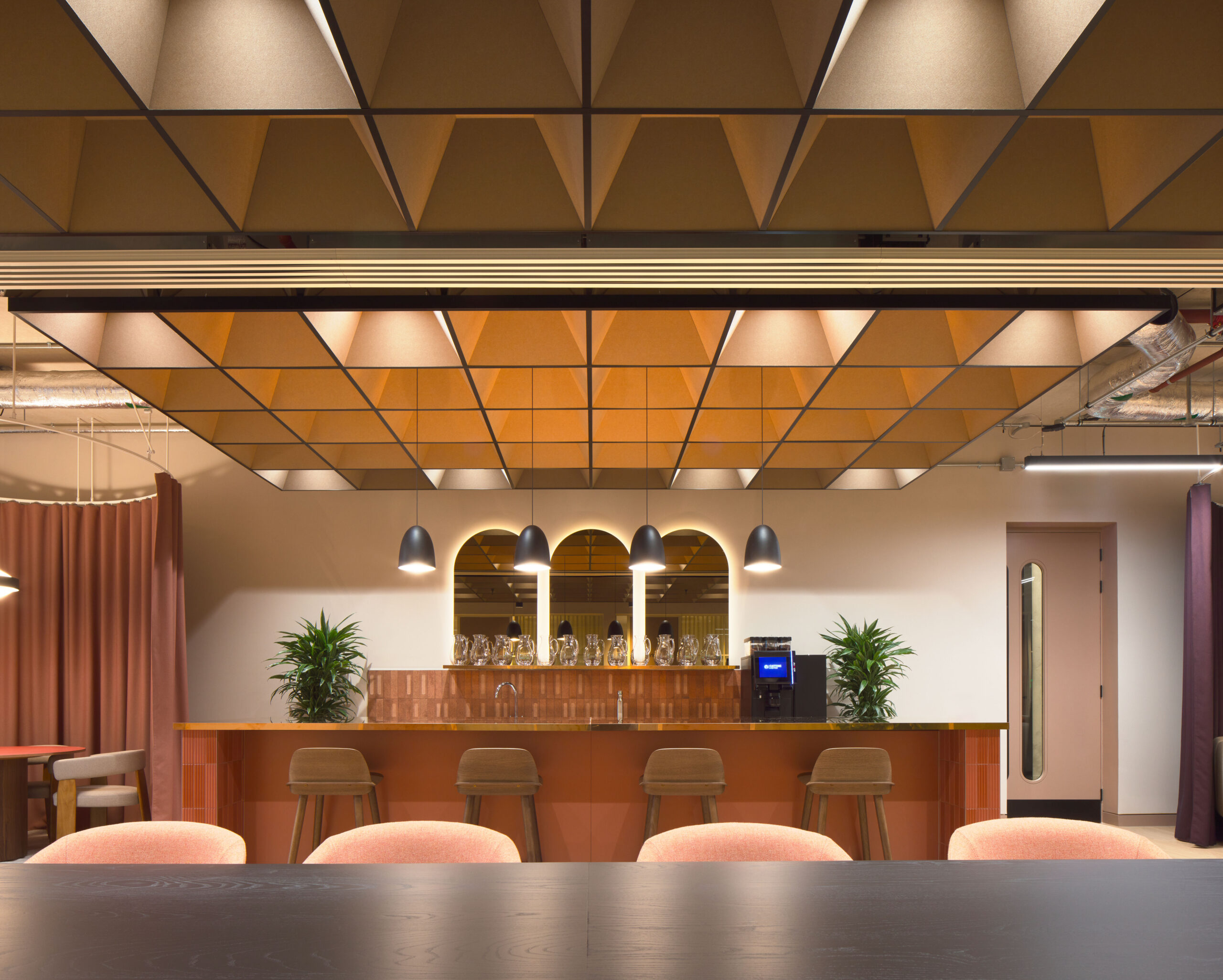
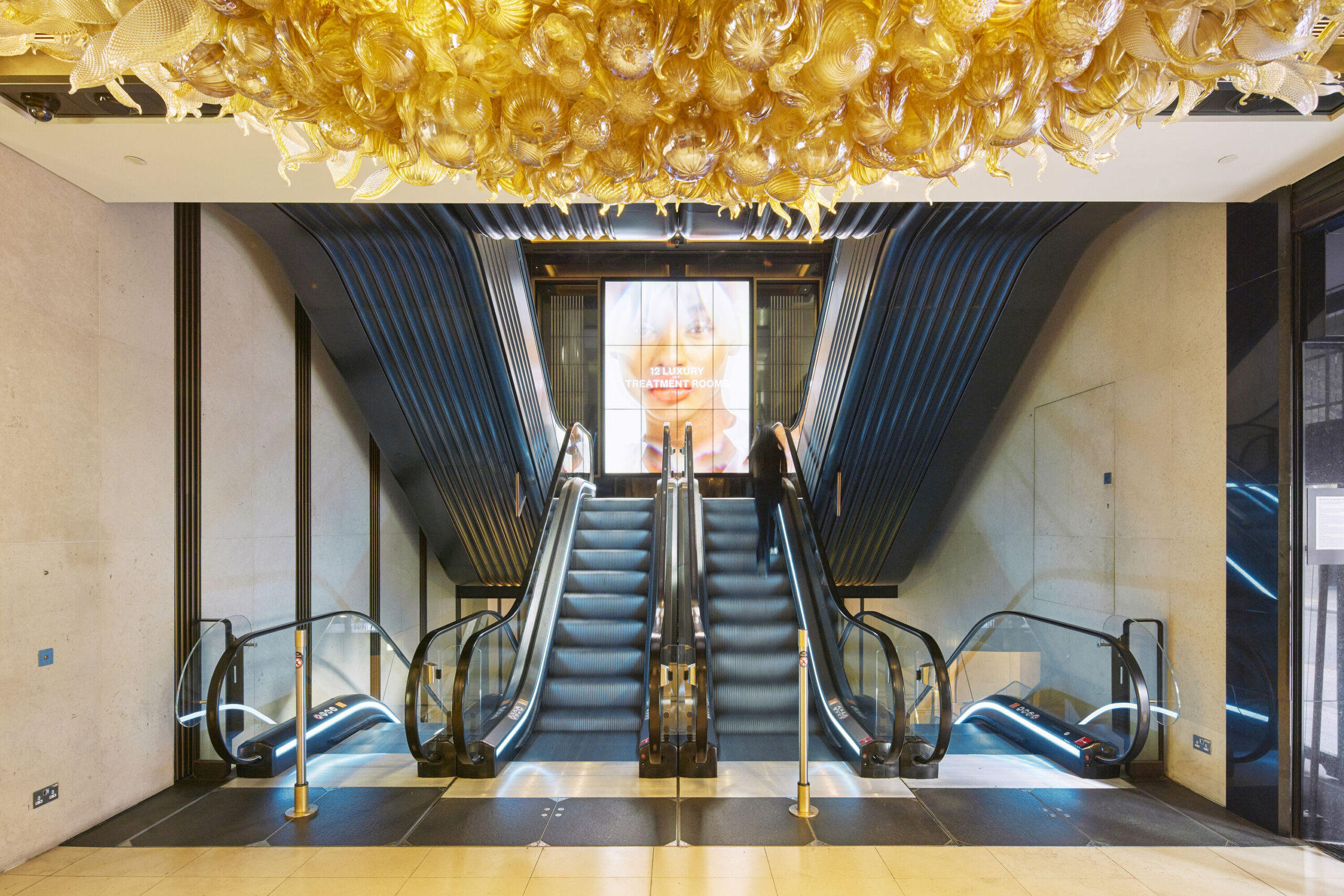
JM The office buildings they commission are not vanilla CAT A speculative offices; they’re site-specific, with an artisan quality throughout. The shared spaces in this project are phenomenal, with more of a hotel aesthetic than an office. We’ve played with the light levels to give more of a lifestyle feeling. On the ground floor there’s a café/bar that’s available to all the users of the building and to visitors, which is something Derwent has carried through several of its buildings.
MT Learning how they manage their other buildings informed our brief and encouraged us to think about how we could enhance it. Anyone who’s a tenant in a Derwent building could come to this building and use it. It’s got a lot of character. There’s honesty and familiarity in the materials and the structural expression.
JM There’s a consistency too, from the expressed steel frame to the exposed concrete soffits. We agreed with Derwent very early on about the concrete facade treatment, which includes timber board-marked picture frames of concrete on two of the elevations. Delivering these meant going through hundreds of samples with the contractors. There was a certain softness we were looking for, and I’m so happy we achieved it.

MT Shutterboard concrete’s not a new thing, but had we not spent the time on it – years of testing mockups, visiting buildings with good and bad examples, researching the weathering – it wouldn’t have worked as seamlessly as it does. The smooth surface we ended up with will weather well.
JM It helps that we always use 3D CAD modelling and BIM modelling. We worked on the services coordination in 3D with Arup, and having that geometric model was absolutely essential for a building of this complexity.
MT We build twice: we build digitally and then physically. Working that way with Arup helped us bring the sandwich of floorplate-to-ceiling down significantly. Credit to Multiplex too, because there are so many different elements they have to contend with as the main contractor.
JM As lead designer, we know the Derwent vision and have been able to communicate that to Multiplex, letting them take the lead with the specialist technical design and engineering. It’s all about communication. It’s up to us to communicate things so they’re understandable. If things are clear, success is likely!
Article extracted from Make Annual 16.
